
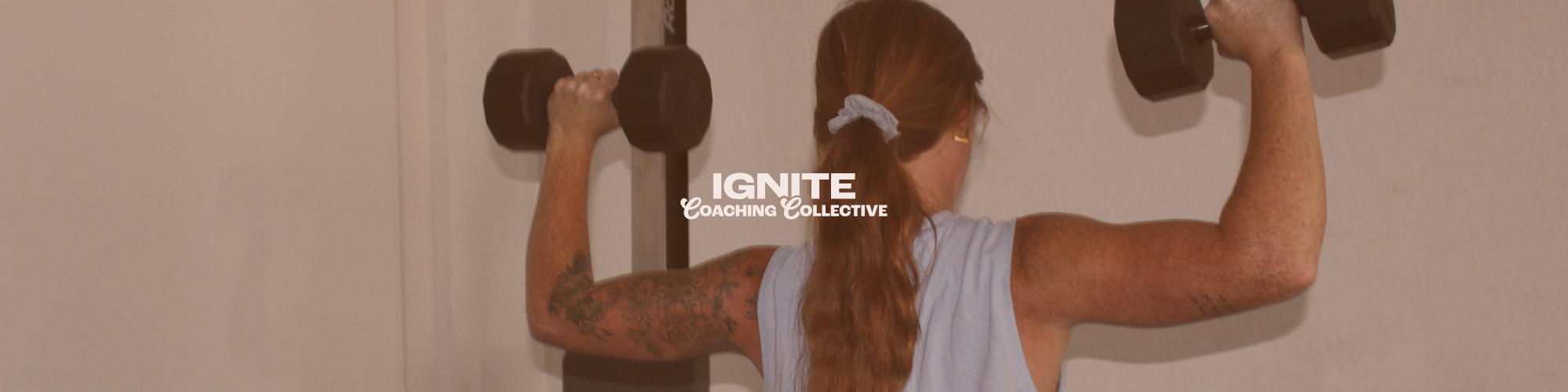
fierce, punchy brand identity + website design for IGNITE COACHING COLLECTIVE
FITNESS + WELLNESS
THE PROJECT:
Ignite Fitness & Nutrition is a coaching brand built around mental resilience, physical strength, and honest accountability. I partnered with Lexie to create a bold, flexible brand identity and website design that reflects her no-bullsh*t coaching style while still feeling personal and grounded.
SERVICES:
Mini Brand Identity + 3-Pg Website Design
ignite
the shop : pilates + performance
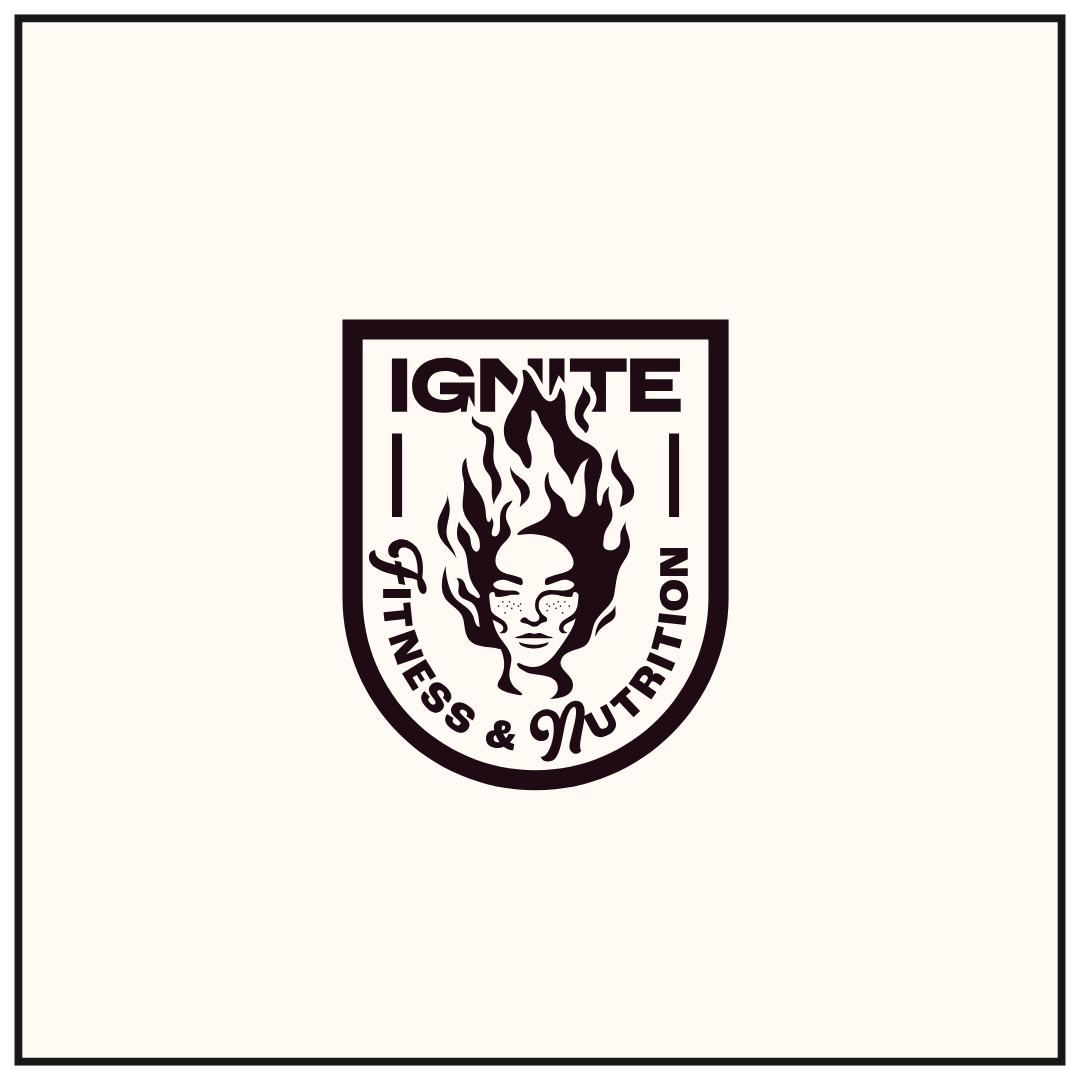
primary logo

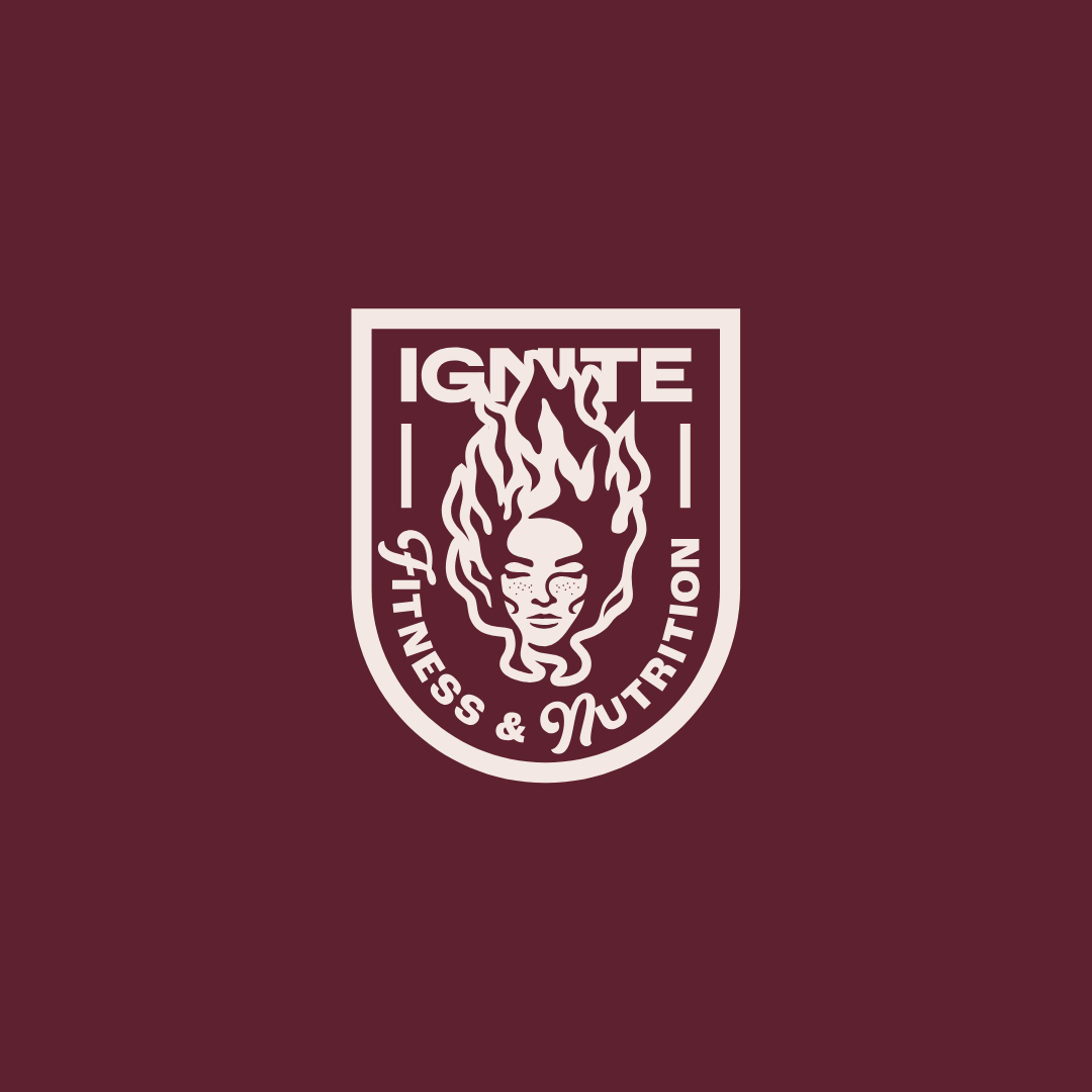
submark logo
secondary logo
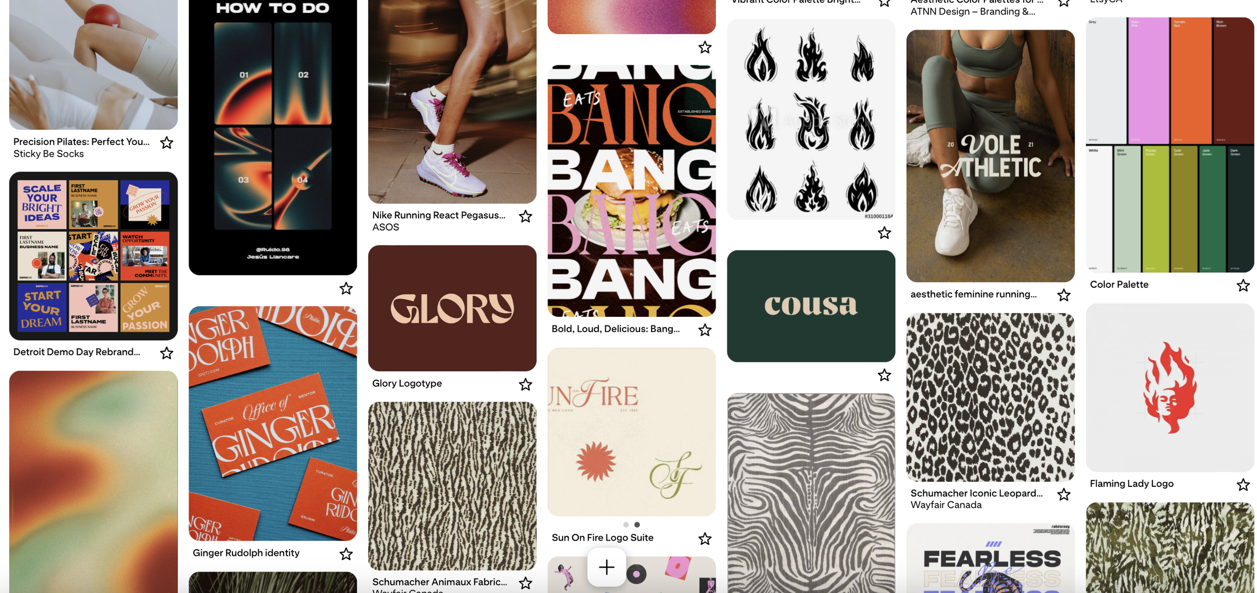
mood board
Creative Exploration
The creative direction balances intensity with approachability — strong without being aggressive, bold without being rigid. Deep, moody tones paired with warm accent colours, confident typography, and edgy illustration elements were used to reflect Ignite’s core belief: real change happens when structure meets individuality.
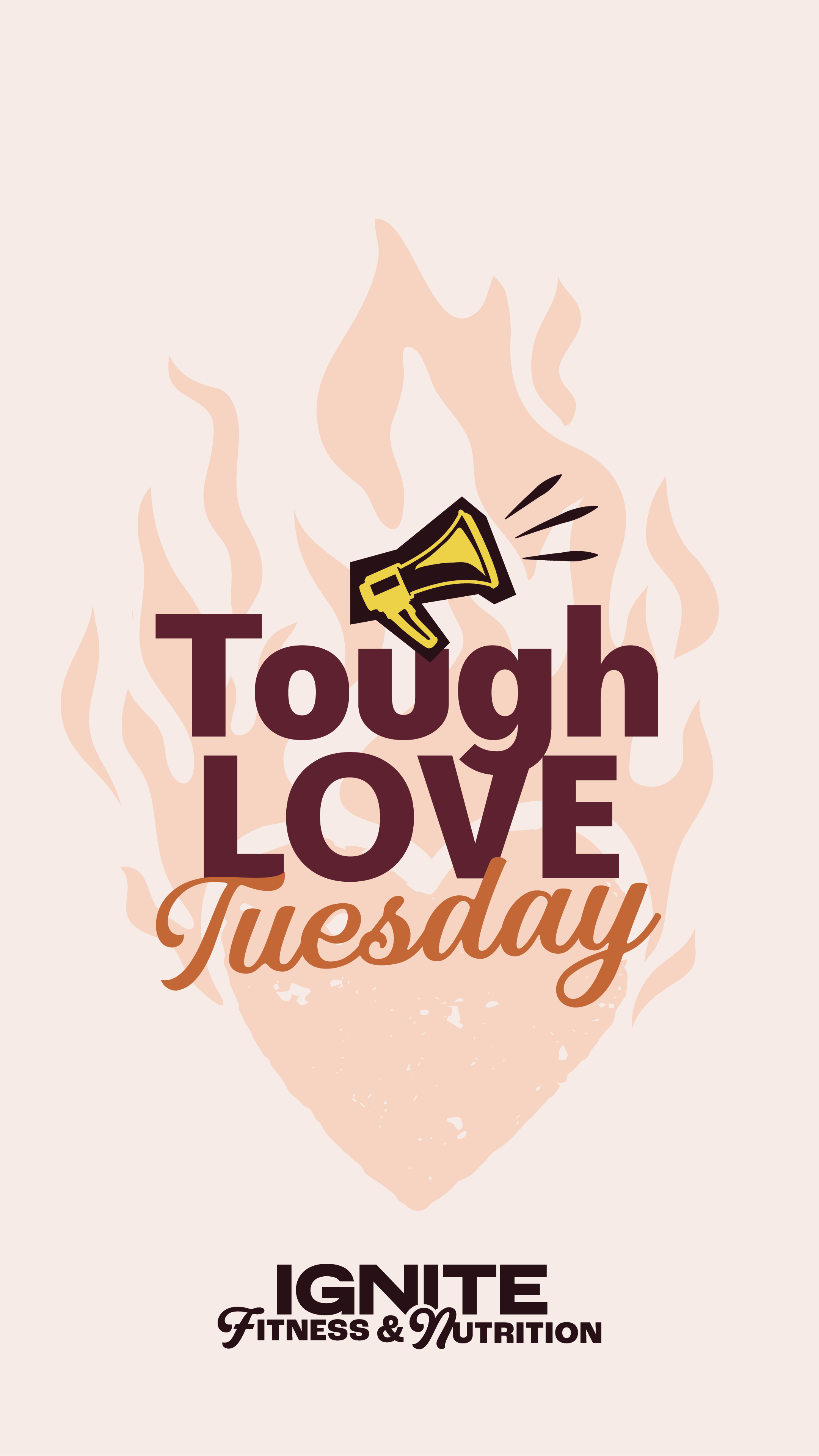
reel cover sample
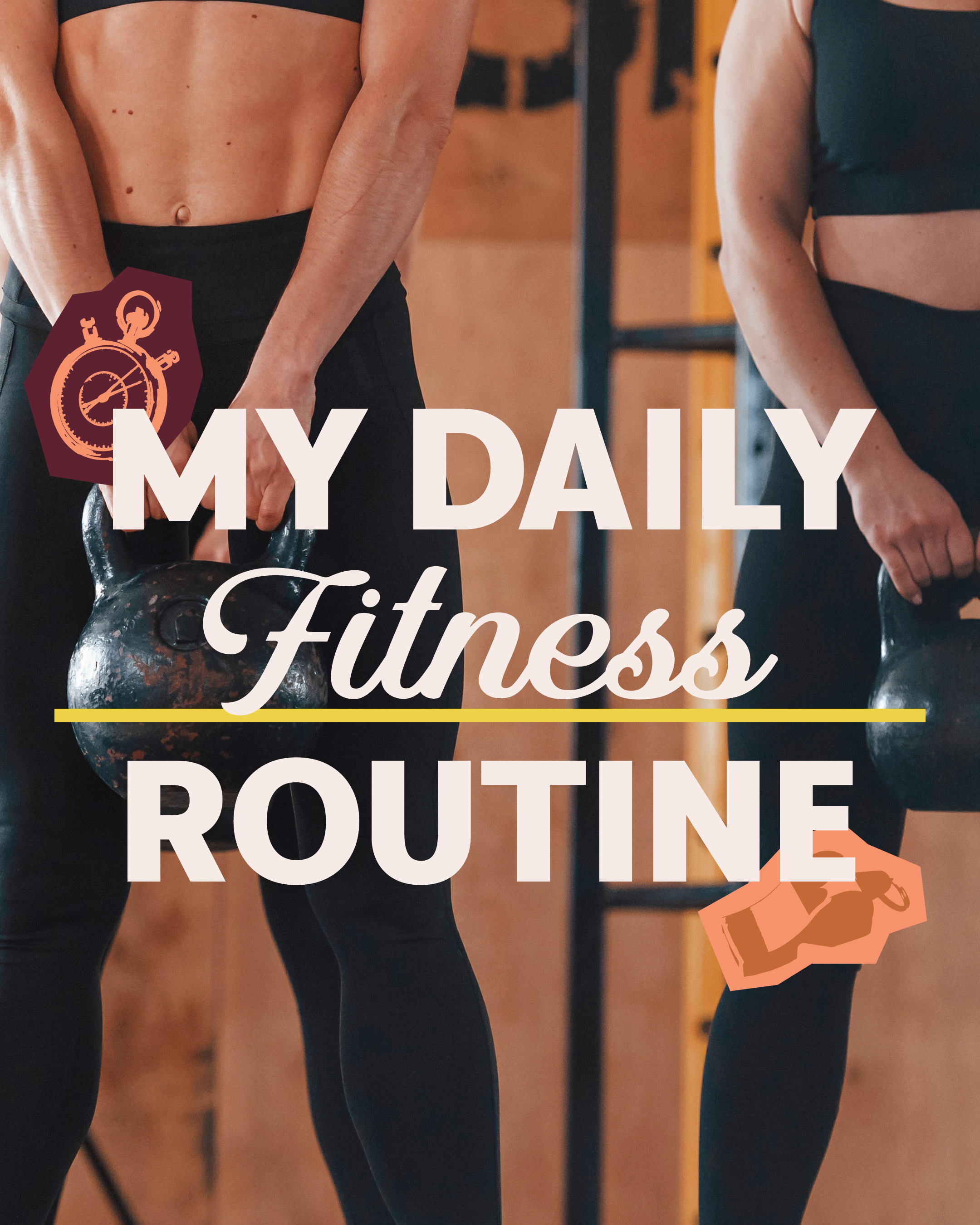
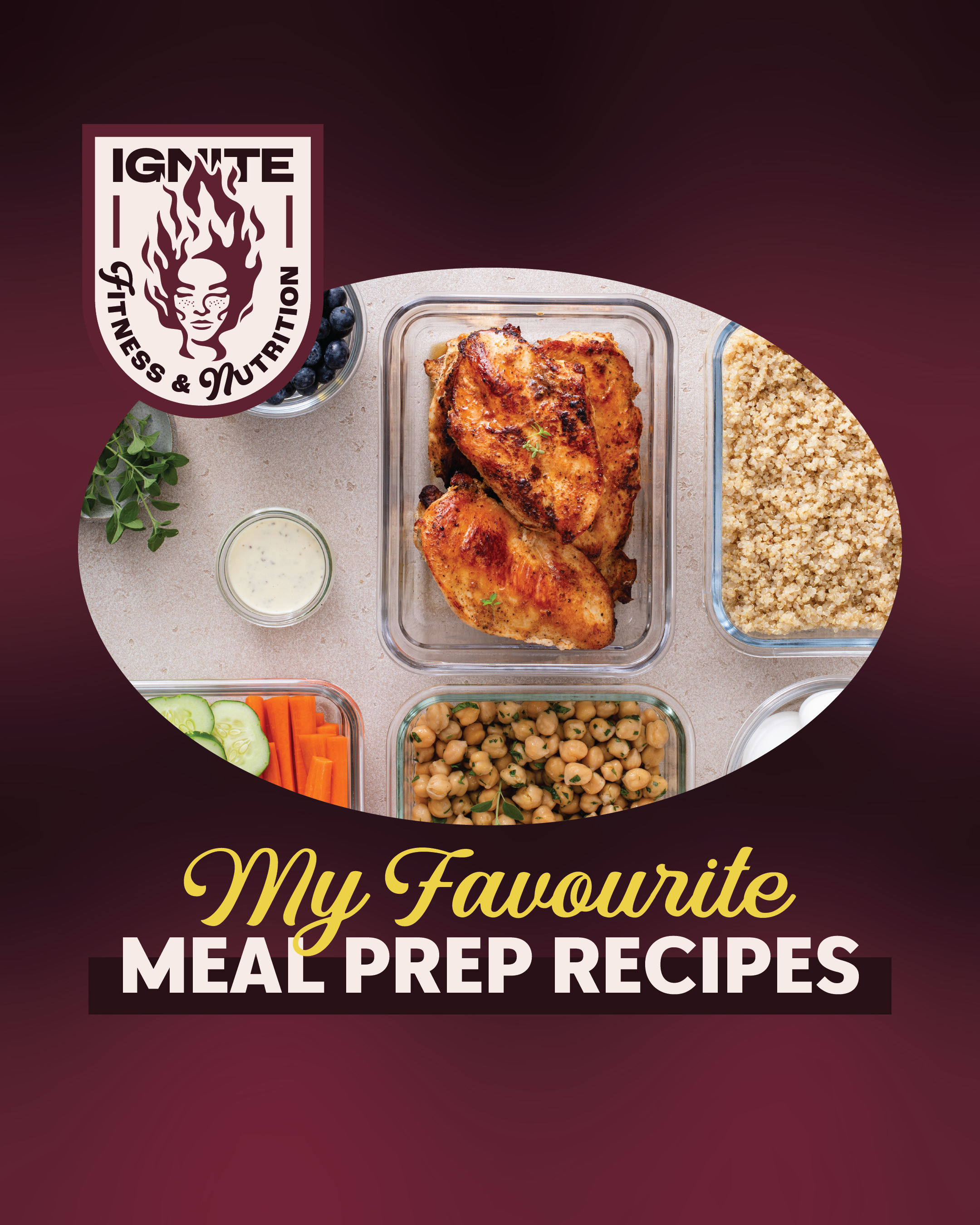
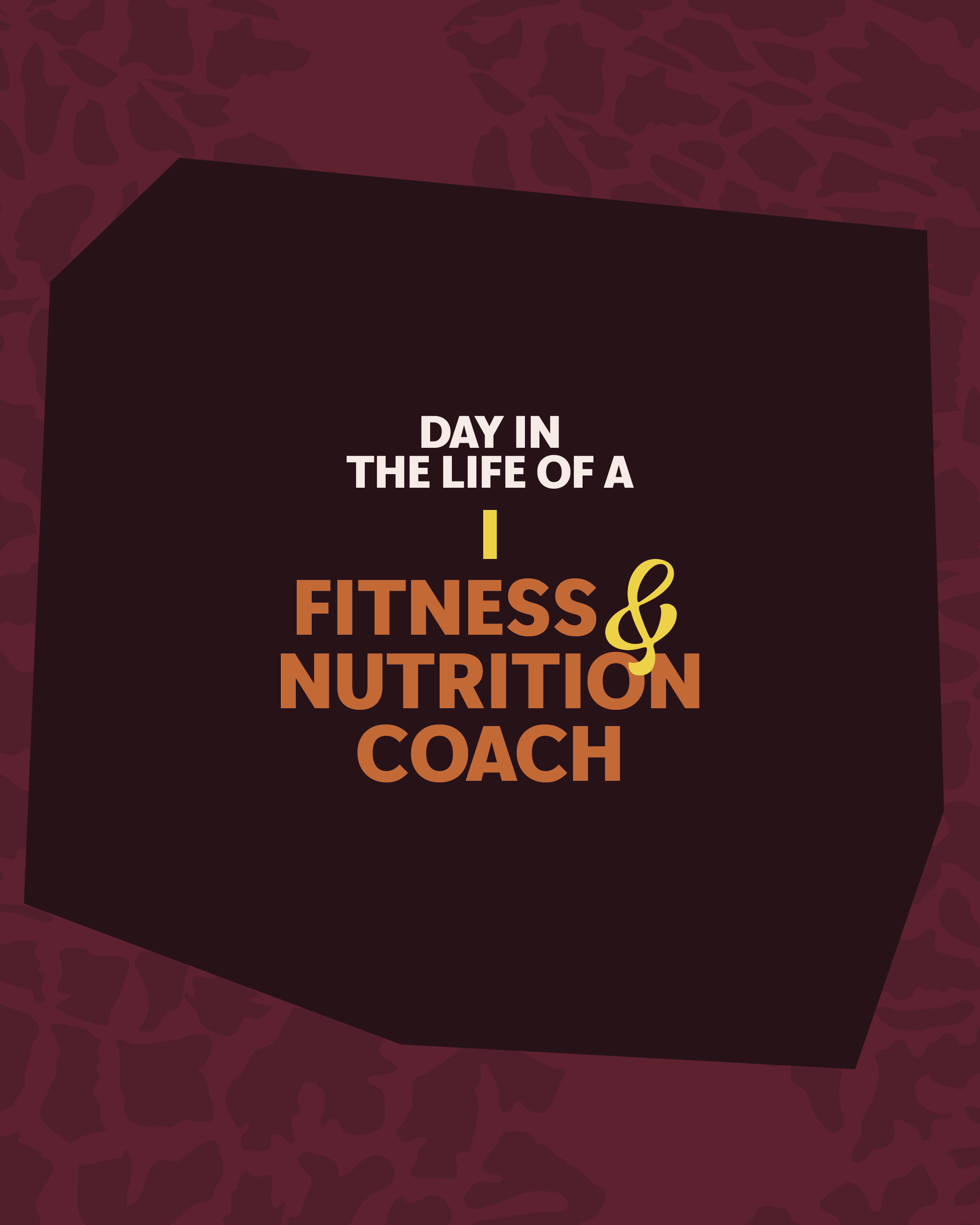
social media samples
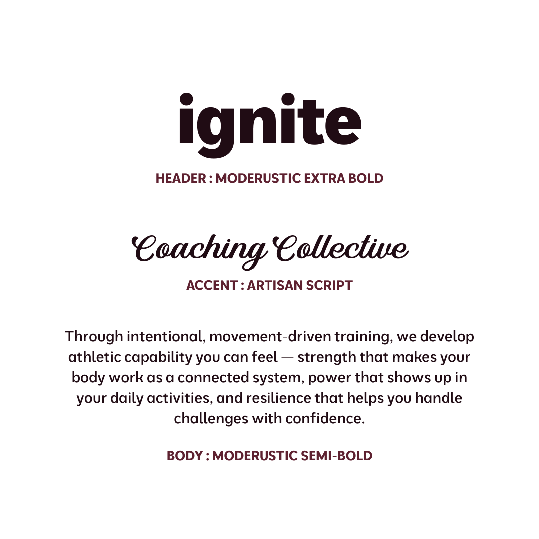
typography/font hierarchy
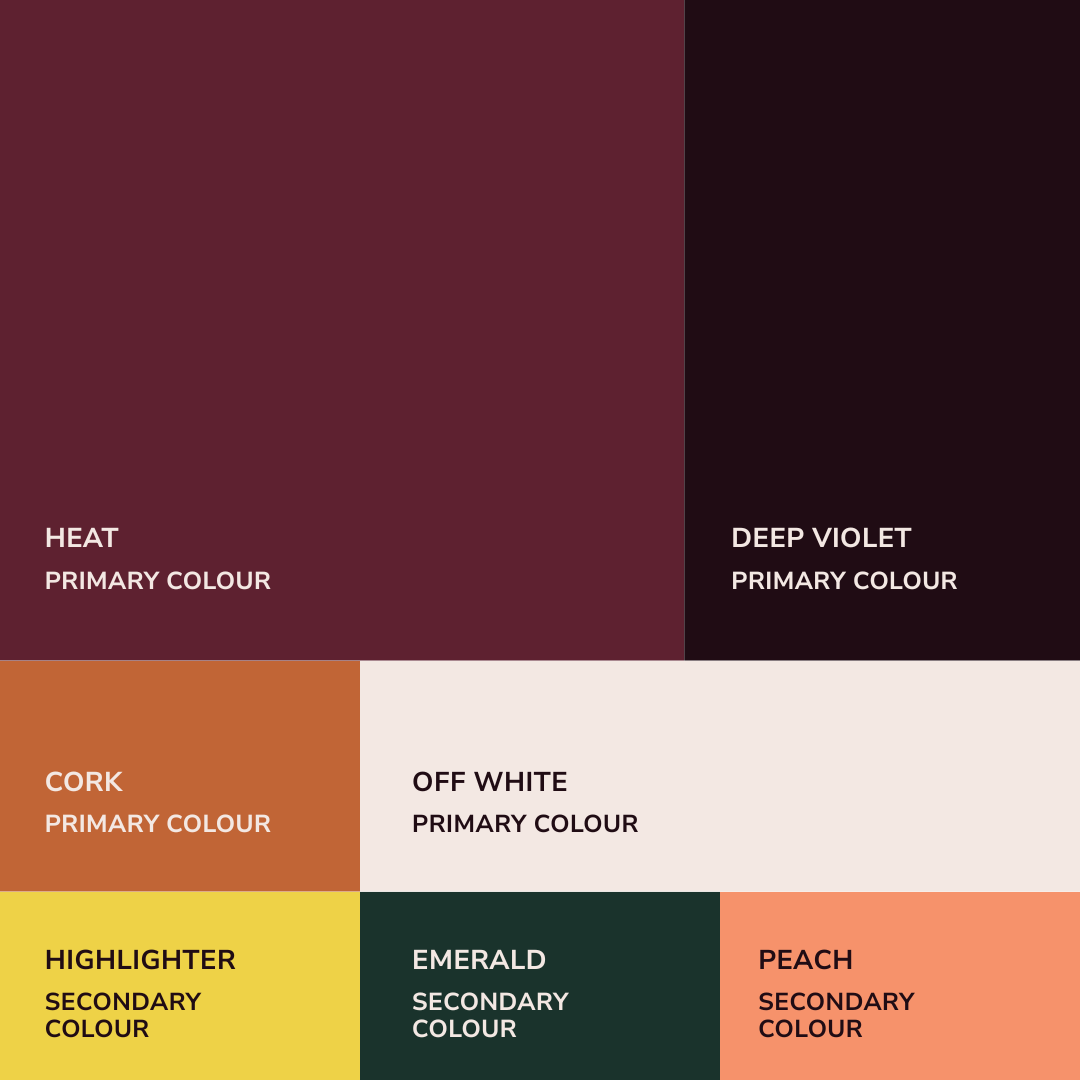
colour palette

icon illustrations
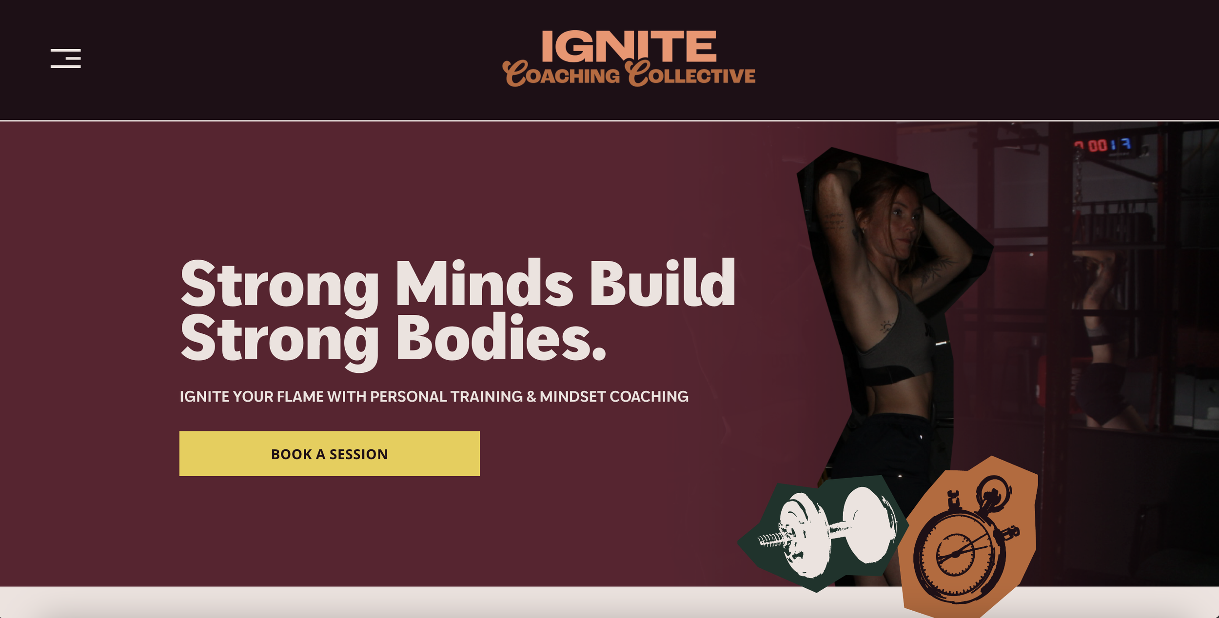
website design
Visual Application
Rooted in the idea of mental and physical resilience, the Ignite brand blends bold, grounded typography with warm, fire-inspired tones and graphic elements to create a visual identity that feels strong, motivating, and energizing. The rich palette of deep violets, heat-driven plums, and earthy neutrals reinforces themes of transformation and inner strength, while the icons and emblem-style marks introduce a sense of grit, growth, and personal evolution. Across applications, this balance of structure and warmth allows the brand to feel both authoritative and approachable—supporting high-impact coaching content, educational posts, and client-centered messaging with a cohesive, empowering presence.
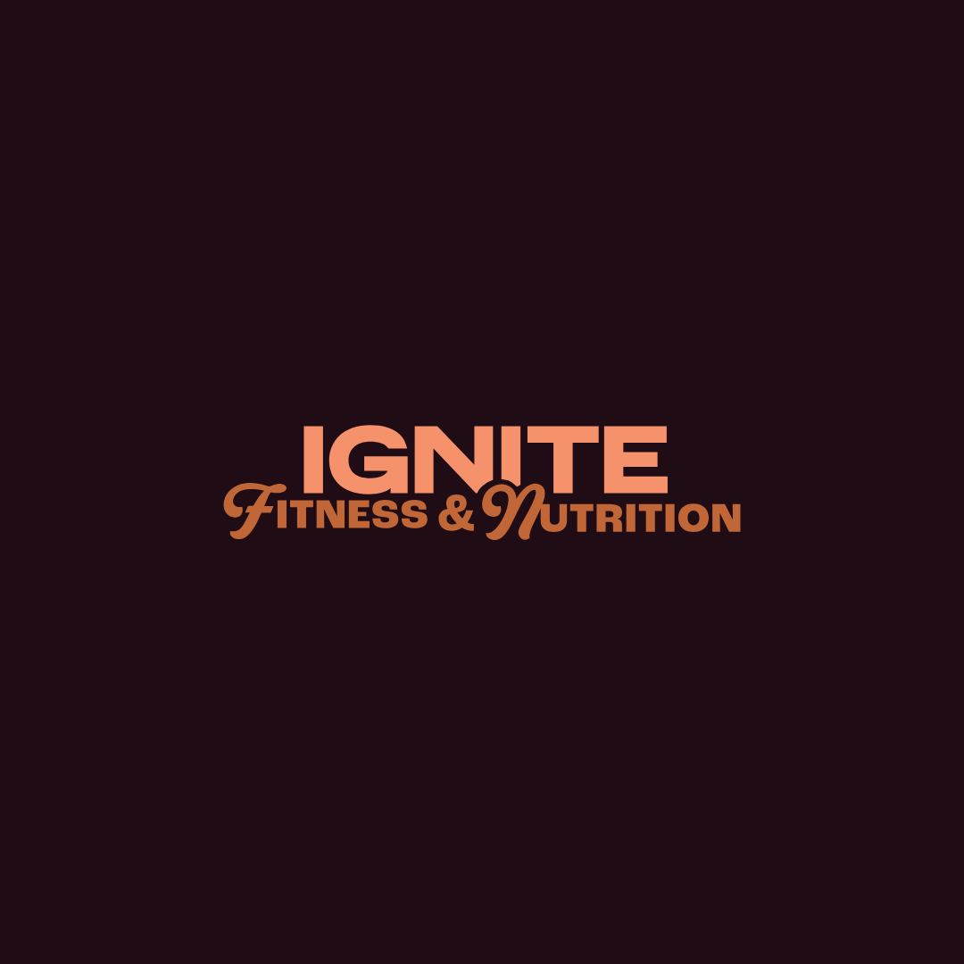
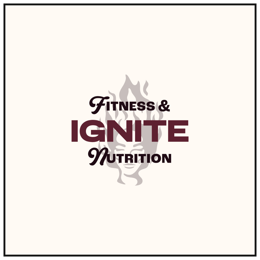
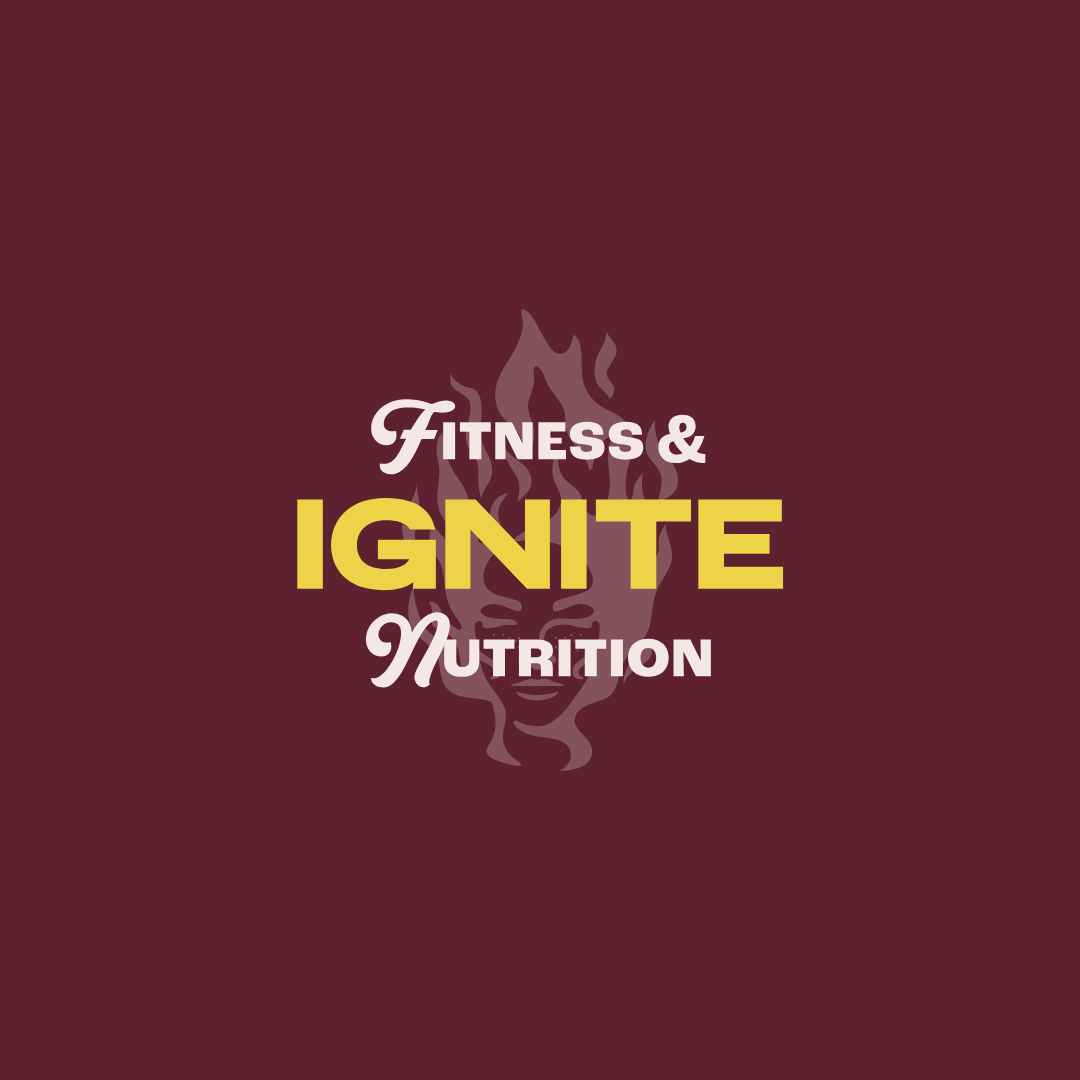
wordmark logo
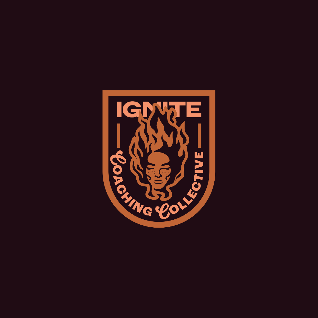

primary logo
submark logo
primary logo

secondary logo
submark logo
brand overview :
email newsletter sample

submark logo