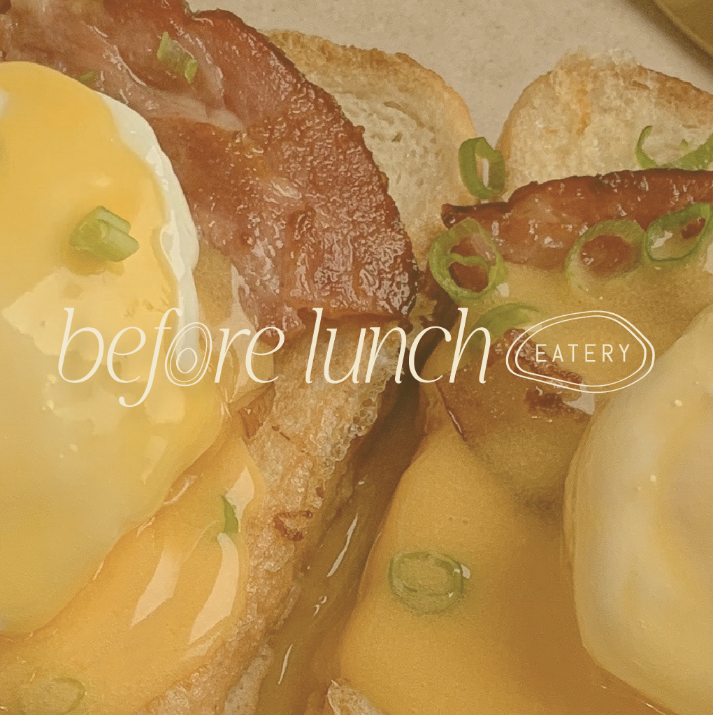
before lunch eatery
With this passion project I wanted to create a visual identity for a brunch restaurant that is a trendy, “instagram-able” spot to go with the girls, but also a place where the entire friend group feels like going to on a hungover Sunday morning. This is visually communicated by combining more elevated elements, like the serif font & badge style logo, with a more relaxed & playful style, as seen in the hand-drawn pattern & icons.
project scope:
PASSION PROJECT
buzz words:
TRENDY, ARTISANAL, LAID-BACK
brand in action
Mock-ups help to contextualize the all brand assets. Not only do they demonstrate how all of the brand components will interact but they can also act as a visual brand guide for future brand collateral.
logo suite
Primary Logo: is the main graphic that represents your business and is used most often. Secondary Logo: is a simplified version of the primary logo - designed to suit spaces where your primary logo does not fit correctly. Submark Logo: is used when the design must be resized to fit extremely small formats.
brand assets
The brand’s icons, fonts, colour palette, & patterns are used to showcase the brand without the use of the logo. These can be used across all digital & print collateral
social media posts
A curated consistent look & feel for the brand’s social media feed, using graphic elements & photography.


