better daze
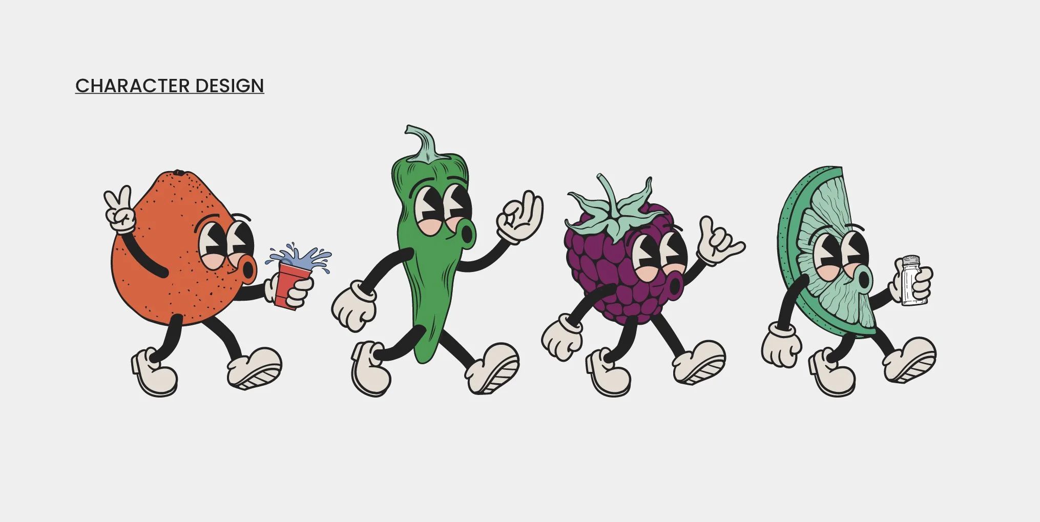
Is a tequila soda created by Canadian Party Life & made by Niagara Falls Distillery. To acquire the right logo & packaging design for their new drink, Canadian Party Life ran a contest and I WON! The brief was very broad but I couldn’t get the idea of the retro lime character out of my head so I knew I had to run with it. They ended up loving it and wanted to create a whole roster of characters for each flavour. I am beyond happy with the final designs, I think they are iconic & exude the feeling of having better daze.
project scope:
LOGO & PACKAGING
buzz words:
RETRO, BOLD, & FRESH
brand in action
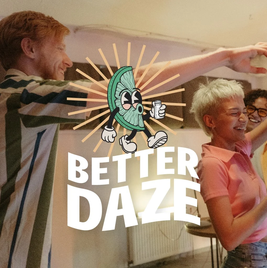
Mock-ups help to contextualize the all brand assets. Not only do they demonstrate how all of the brand components will interact but they can also act as a visual brand guide for future brand collateral.
logo suite
Primary Logo: is the main graphic that represents your business and is used most often. Wordmarks Logo: is a simplified version of the primary logo - designed to suit spaces where your primary logo does not fit correctly.


